Following Hogarth.

Hogarth was born in London 1697 and died in 1764. He started his career making trade cards. In his spare time, he did sketches of people around him and friends. He recorded life in the London streets unknowingly beginning the start as a reportage artist. He married the daughter of Sir James Thornhil who was a well-liked artist at the time and ran an art academy. Hogarth was known for mocking the wealthy and the politics of the time. It was the start of the industrial revolution. This had begun to affect the way society viewed the classes. The middle classes and upper class were no longer experiencing the financial divide there had been in the past. Rich merchants and businessmen alike were wealthy and interested in purchasing works of art. Some did not like his work; finding it comical rather than art. However, this is what endeared him to the middle and working classes. The consequence and troubles of wealth at the time were in the forefront of Hogarth’s mind as his own father was sent to debtors’ prison after a failed business idea. 

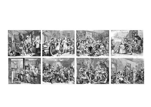
For Example these eight prints called “A Rake’s progress” tells the story of a young man’s rise and fall in wealth. It is a morality tale of the evils of 18th century life, the triumph of commerce that led to the forming of new middle class young men. The way they craved pleasures and novelty, and the traps that can befall them. 


So time for me to have a try….


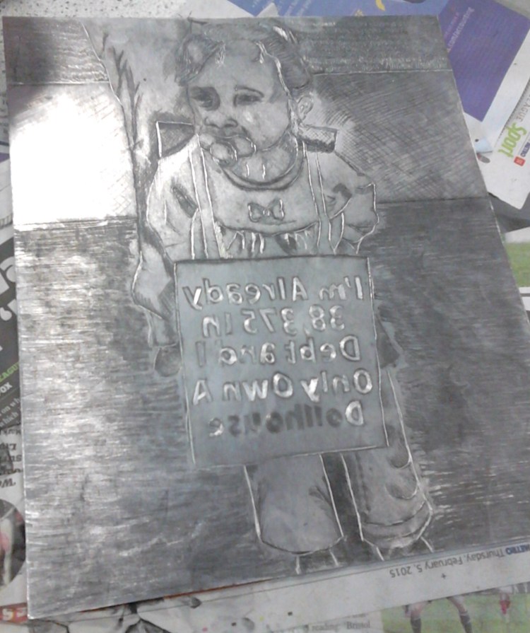
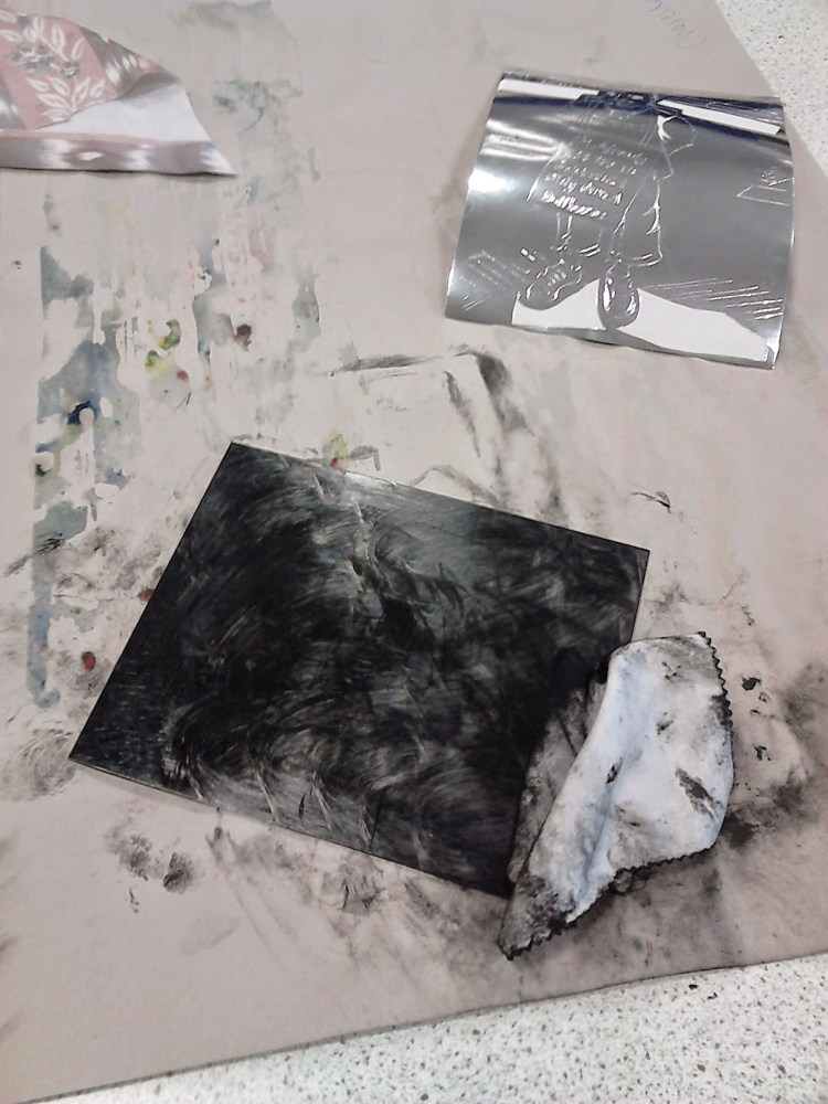
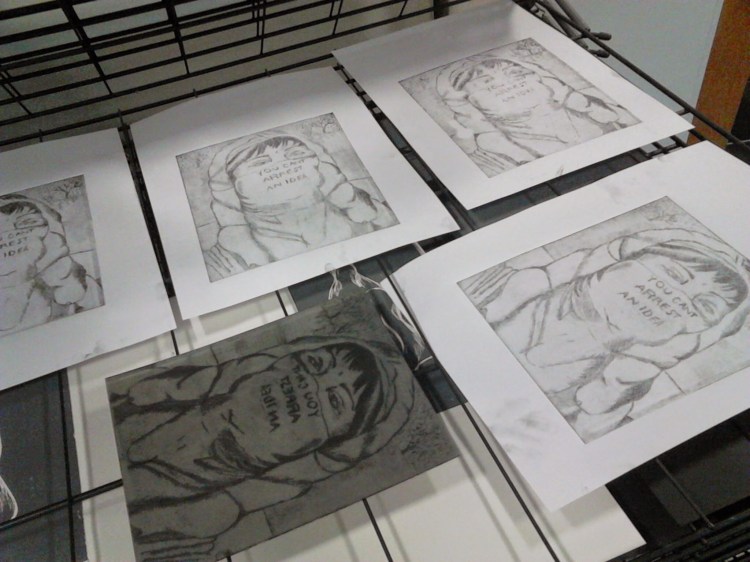
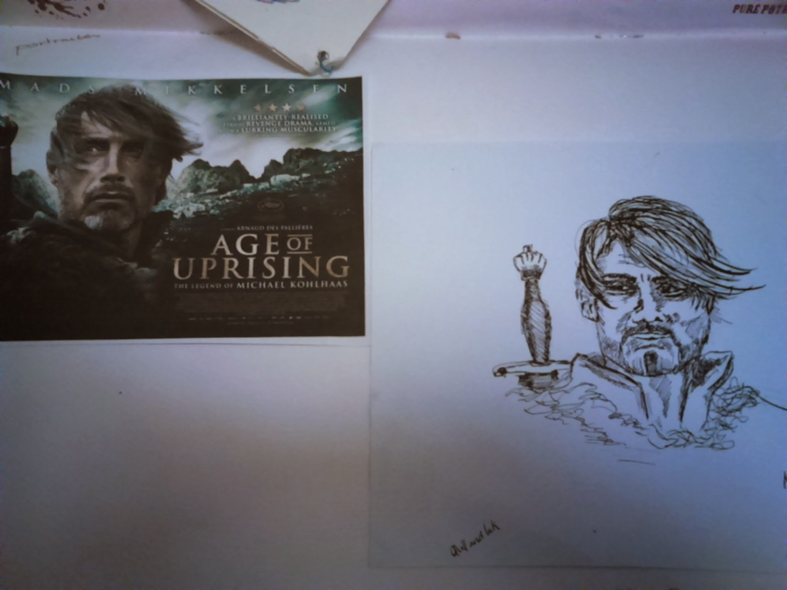
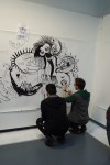
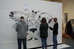
Engraving plate printing was amazing. I chose to do this for my final to the project because of the inspiration from Hogarth. I combined the disciplines of reportage and satire by the choice of image. However the process it is not for the faint hearted, it was a lot of work to get just a line at a time. For a moment I felt as if I was in a Victorian work house keep scratching away at the metal rectangle in front on me. It is incredibly messy too.  The result is worth it though. Despite the fact I struggled to get depth with my mark making by the end I was beginning to see how the effect was made. It took trial and more trial pieces to get the right combinations of plate marks and amounts of ink. Often I would clean the plate and go back to making more marks. When you look at them at first you can’t see what is different, yet as you look you notice the changes and the way to work becomes more apparent. I am happy with the resulting two images but know more work into the plates were needed to improve and maybe a better choice of backgrounds would help.

Using Ink

  There are many pens on the market that you can choose from. Or if you are the adventurous type you may decide to make your own from feathers the way our forefathers did. You might also try different sticks, reeds, bamboo or other exotic materials. The crow quill dip pens and metal replacement points are still a good choice.

  Many companies manufacture India Ink and the quality of each depends on the process used by each company. India Ink is a mixture of water, carbon black (lampblack) and a binder of shellac, latex and other binding materials. The finer the lampblack usually the more flowing the ink. It is also very important that use choose ink that is not water soluble unless that is a planned part of your work. I use inks that are classified as permanent and good for all surfaces. Ask your local arts supply or an artist in your community what they use.

My attempt . I used 3×0/.25mm, and 00/.30mm, nibs.


Some good help I found off the internet.

Pen and Ink Lesson 2 from Home School Arts
Line and Value


     With this media line is the most important tool you have. The closer the line the darker the drawing looks. Inversely the farther apart your line the lighter the drawing looks. Let’s take a closer look at each of these styles.


     First lets look at the straight line and the effects that this can create.


Horizontal line (example A) can create the illusion of movement from side to side. This effect can be used to create the illusion of motion or reflection in the water.
Vertical line (example B) can create the illusion of movement up and down. It can also convey the feeling of distance and atmospheric conditions.
Diagonal line (example C) can create the illusion of rotation like a planet. It generally denotes roundness and mass.


     Each of these styles also mimic old-fashioned wood or line cut prints in their appearance. Illusion is not only the purlieu of magicians but also that of the artist. Making an object look three dimensional on a flat piece of paper is almost magical but it is not. It is just a matter of perception, the way in which we see.


     In example “D” we are starting a crosshatching process and right now this drawing looks pretty flat. As we add lines as in example “E” the illusion of roundness begins to come through. The more and closer the line the more the illusion seems real. However one of the more important personal tools you can have is, knowing when to stop and how much to add.


     Example “F” is just about right, however notice how example “G” is much more effective in illustrating roundness than example “F”. This is a contoured crosshatch drawing. It is contoured in two directions and creates a better illusion of roundness.


Copyright Labyrinth Conceptions/HomeSchoolArts 1997-2006©

In conversation with EIMEAR MCBRIDE

eimear-mcbride_event_image

We were not permitted to take photos so this is a stock photo.

Thanks to an email from Wolverhampton University I was able to tag along to an event by the Transcultural Research Centre.

Eimear McBride is an Irish novelist whose first book A Girl is Half-formed Thing has won Irish novel of the year 2013 and the 2013 Goldsmiths prize (and more). We were able to listen to her speak about the book and about her experience of being a writer.

McBride wrote the book when she was 27 however it took 9 years to find a publisher. She had trained as an actress and moved to London so the first question was how did this book come to be?

“I was always writing as a child. Leaving acting was easy as I was sure that I was not that great at it. So I did temp work and wrote and wrote finally I took six months off to write the book. That same week my handbag containing all my handwritten notes got stolen. I had to start over a fresh, but I think it might have helped. I wrote 1000 words a day then the next day I deleted about 800+ and wrote another 1000 until it was done.”

Even though you wrote the book in six month it took nine years to publish?

“Yep. I just kept sending it out until if found the right person, or the right time.”

Its written in a poetic style is that your style or just for this book?

“Just this one so far, I adore James Joyce he and I enjoy language and pose. I knew I wanted to write from the characters point of view and as she thought.”

McBride says later on…

“James Joyce inspires me as an Irish witter he wrote about Irish women but he did not write about what it is to be an Irish woman. I write from within this woman, my character. I have a modernism style I guess, but I really look at modernism as a tool for expressing the physical experience the character has. Putting the soul back into the body you could say. I wanted to re-connect the wording and reader to the physical being of the character. When you read the book you can understand this aim better. ”

Is this story written for girls in mind or women in general?

“Not at all, it is defiantly not for young girls to read. The book is about a person being a woman but I find that men enjoy it too. It is interesting to both genders to explore a person’s story. In my opinion you should not write as a gender but as a human. The book won women’s awards and this was just a helpful platform for the publicity not a division for it to be in solely.”

Do you think that you needed to be out of Ireland to be able to write about it?

“Yes I think it’s much harder to write about a place when you in it every day. It is easier to write what you remember.”

Do you feel people try to put you in boxes assuming you are part of your character, in some places or experiences during the book?

“No because I made it very clear this was a work of fiction. I do not talk about my own life or project my experience on to this character. My character is very physical and makes physical choices and that’s why I like her. Life is wasted on the passive. She insists on her right to be active and that’s her empowerment. I wrote her that way.”

What advice would you give to new witters emerging into the industry today?

“Well people will have expectations, but I write what I want and what I feel, not really caring about what might be trending. So, my advice is to write for you. Look at it and know what is yours. Don’t change it to meet someone else’s desire. Keep going with a story until you know when it is right to stop.”

LE GUN @ Worcester University

DSC00020

We were so lucky to get invited to join third year illustration students at Worcester University in working on a collaborative 20ft (!) piece with artists from LE GUN.

The illustration collective LE GUN was founded by Neal Fox, Chris Bianchi, Bill Bragg, Robert Rubbish, Matthew Appleton, Alex Wright and Stephanie von Reiswitz. The graduates of Royal College of Art produce a magazine and work on commissioned projects. They recently had a hugely successful installation and prints for an exhibition opening at London’s V&A Museum.

We were guided into a new and strange world by Neal and Robert the theme was following on from their exhibition about Mexican dream creatures called Alebrije.

Neal and Rob Nealandtibias

While I worked away I was able to ask Neal Fox a couple of questions:

Q, What inspired you to become a collective?

“Well we knew we wanted to become a magazine when we saw the New York mag RAW and we were coming to the end of our studies four of us were mixing regularly with other graphics’ students and we just bound together. We came up with the long black and white collaborative when we were raising money for the Mag idea. We had these parties with the walls coved in paper that people could doddle on and say what they want. It was so popular we realised we had hit on something.”

Q, Don’t you ever fall out or struggle with seven different minds pulling a project?

He shakes his head amused at the question “No, not really, for a start we are well practiced at living with each other’s passions. Also we talk about it lots before we start. We always start with developing a story or fictional history to the exhibitions so everyone knows where the theme is going and then we trust each other. It has not failed before and we enjoy it.”