There are many pens on the market that you can choose from. Or if you are the adventurous type you may decide to make your own from feathers the way our forefathers did. You might also try different sticks, reeds, bamboo or other exotic materials. The crow quill dip pens and metal replacement points are still a good choice.
Many companies manufacture India Ink and the quality of each depends on the process used by each company. India Ink is a mixture of water, carbon black (lampblack) and a binder of shellac, latex and other binding materials. The finer the lampblack usually the more flowing the ink. It is also very important that use choose ink that is not water soluble unless that is a planned part of your work. I use inks that are classified as permanent and good for all surfaces. Ask your local arts supply or an artist in your community what they use.
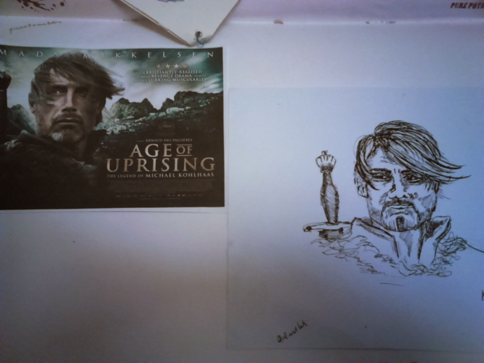
My attempt . I used 3×0/.25mm, and 00/.30mm, nibs.

Some good help I found off the internet.
With this media line is the most important tool you have. The closer the line the darker the drawing looks. Inversely the farther apart your line the lighter the drawing looks. Let’s take a closer look at each of these styles.
First lets look at the straight line and the effects that this can create.
| Horizontal line (example A) can create the illusion of movement from side to side. This effect can be used to create the illusion of motion or reflection in the water. |  |
 |
Vertical line (example B) can create the illusion of movement up and down. It can also convey the feeling of distance and atmospheric conditions. |
| Diagonal line (example C) can create the illusion of rotation like a planet. It generally denotes roundness and mass. |  |
Each of these styles also mimic old-fashioned wood or line cut prints in their appearance. Illusion is not only the purlieu of magicians but also that of the artist. Making an object look three dimensional on a flat piece of paper is almost magical but it is not. It is just a matter of perception, the way in which we see.
In example “D” we are starting a crosshatching process and right now this drawing looks pretty flat. As we add lines as in example “E” the illusion of roundness begins to come through. The more and closer the line the more the illusion seems real. However one of the more important personal tools you can have is, knowing when to stop and how much to add.


Example “F” is just about right, however notice how example “G” is much more effective in illustrating roundness than example “F”. This is a contoured crosshatch drawing. It is contoured in two directions and creates a better illusion of roundness.
Copyright Labyrinth Conceptions/HomeSchoolArts 1997-2006©
