History and Process
Screen printing is one of the most popular printing methods we use to create custom designs, patterns, and logos on clothing. The process of Screen printing involves a fine mesh “screen” that is stretched around a frame. The areas that masked out on the screen are not printed. We used the photo-emulsion screen printing process, which is great for printing text or images with fine detail. To create the print, we took a black picture that we drew on the translucent Mark resit paper, place it against the screen, and then expose the screen to UV light. The light causes the emulsion to harden and bind to the mesh. It was explained that where the light strikes the screen, the emulsion will bind, making a solid layer. Where the light is blocked (black image) the emulsion remains water-soluble.
After exposing the screen, we spray down the screen with water, washing off the emulsion. Where black of the image was is a clear area is where the ink will be pressed through the screen. The framed screen is positioned over the item to be printed, along with a spoonful of thick ink. A squeegee is then used to press the ink through the screen. The masked areas prevent ink from passing through, but the unmasked areas allow the ink onto the material. I didn’t have any issues up to this point having done Screen print at University of Worcester however id never done fabrics, technical issues around “pinning out” the t-shirt and dealing with coarser, denser fabric than cotton was new learning for me. Pins needed to be flat to the print bed surface so not to damage the fine mesh of the screens nor catch the track of the squeegee passing the pint through. The main technique was to pin the fabric at a sharply acute angle and Masking tape over the pins seeming to be the best way to ensure no damage to the mesh in the screen. Also finding an even pressure using the squeegee one-handed was an issue for me. I discovered I was better left-handed in this process.
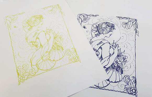
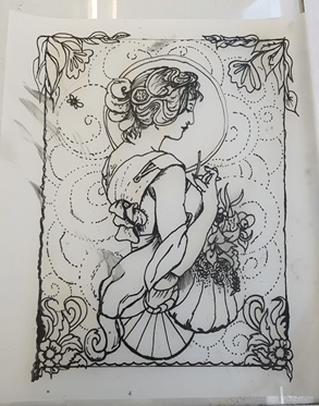
Above is my design printed on to paper in mustard colour and on cotton blend in blue. Both pieces have come through the screen with most of the detail still intact. In parts of my border and halo, my line was not dense enough, and the UV light was so intense as to burn through the resisting area. The composition has worked well, and I felt comfortable mimicking the romantic 19th-century ladies and Morris’ flora style. When thinking on possible additional elements during the design stage, I opted to leave the flower head the lady is admiring missing. I plan to use digital embroidery to make the flower head, thus incorporating a modern process with a more traditional. My reasoning was to reflect on the struggles Morris felt about the industrial influence of his ere upon the textile production at that time.
Artist influence
Having been at Birmingham Art Gallery and Musume the day before I was keen to bring some of the William Morris designs, I’d looked at into the print.
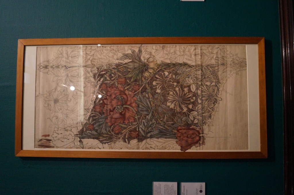

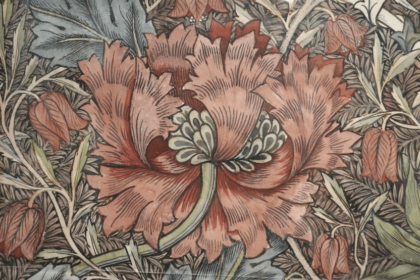
[Photographs of Morris’s ‘Honeysuckle’ 1881 I took on my visit to Birmingham art gallery] Morris’s original design for ‘Honeysuckle’ hangs in Birmingham’s art galley. This design became a set of linens sold in the shop on Oxford Street in 1800’s after Edward Burne-Jones insisted on have the print for his own home.
William Morris was a famous 19th-century designer notably recognised for his nature-inspired wallpapers. My interest in his work leans more to his collection of book designs. Morris also produced tapestries, tiles and textiles with an expressed love of hand-produced items and a craft-based artistic community.
“A key figure in the Arts & Crafts Movement, Morris championed a principle of handmade production that didn’t chime with the Victorian era’s focus on industrial ‘progress’.” (V&A, 2019)
Despite never needing to earn a wage due to the inheritance of the large Woodford hall family estate in Essex, Morris was a hardworking and prolific.
“In 1875 Morris became sole director of the renamed and restructured Morris & Company. Over the next decade, he continued to design at an impressive rate, adding at least 32 printed fabrics, 23 woven fabrics and 21 wallpapers – as well as more designs for carpets and rugs, embroidery and tapestry – to the company’s range of goods.” (V&A 2019)
Much of Morris’s childhood was spent exploring local parkland and forest his love of nature always apparent in almost all his work. Also, at an early age, he showed a passion for the church, including its architecture, something he would later explore as a career. Morris went to Oxford University to study for the Church. It was there that he met Edward Burne-Jones, who was to become one of the era’s most famous painters, and Morris’s life-long friend.
A lesser know influence that was consistent, but didn’t become his passion until later in life was his love of fantasy. As a young man, Morris was enamoured by the writings of the Scottish fantasy author Walter Scott. Rumoured to be his favourite of Scott’s work was the Lady of the Lake, a poem published in 1810.
In 1891 Morris was offered the Poet Laureateship after the death of Tennyson, remarkably he turned it down. Instead, Morris chose to set up the Kelmscott Press. The books the Press produced only totalled 66 before Morris’s death in 1896. The appeal was these books were beautiful and prized. Printed and bound in a medieval style, with Morris having designed their typefaces, initial letters and borders it is not hard to see why. Ever since I was lucky enough to see The Book of Kells, a precious 9th-century manuscript, at Trinity College Dublin in 2018, I have been influenced to make better use of framing devices for the text in my work. The Book of Kells is an exquisite combination of ornate Latin text and intricate illuminations. One of the world’s most famous medieval manuscript and the images are rich symbolism worked into the layouts and subject matter. Morris too made translations of ancient and medieval texts, but his love was poetry. ‘The Wood Beyond the World’ a fantasy story by Morris is considered to have heavily influenced C. S. Lewis’ ‘Narnia’ series, while J. R. R. Tolkien is said to be inspired by Morris’s reconstructions of early Germanic life in ‘The House of the Wolfings’ and ‘The Roots of the Mountains’. (Scull and Hammond, 2006.) All three authours are writers who heavily influence my writing of Young Adult fantasy, but Morris in particular also affects my ideas of illustrating for the Young Adult genre.

Above is the more famous of Morris’ Kelmscott Press published books. An illustrated edition of the works of Geoffrey Chaucer, which was published in 1896, a few months before Morris’s death. (item C.43.h.19. at British Library)
How do the works and artist fit into the development of my project?
“I began printing books with the hope of producing some, which would have a definite claim to beauty.” Morris, W. A Note by William Morris on His Aims in Founding the Kelmscott Press. (Hammersmith: Kelmscott Press, 1898)
This direct quote from Morris directed my A’level work back in 2000. I knew soon after I completed my studies that art was my way to contribute to society in a meaningful way. I had/have to work extremely hard at academic studies; it is not a natural learn way of thinking for me. Having great artist, their works and dedications in life to follow and guide gives me a way to talk passionately and communicate why my artwork is so important to my place in the world. As dramatic as it sounds, I do risk a lot in pursuing my goal at a writer and illustrator. Morris didn’t have to fight or peruse the quality of production and beauty he achieved; he could have had a more comfortable life. He chose to give everything he could of himself to not only his work but also the defence of handcrafted and traditional skills. 19-century had its fight with the industrial period, and some skills have been lost forever; currently, we can view the digital and computer-controlled elements as a threat or as Morris did eventually, learn to incorporate them into techniques as a support, not as a replacement to the traditional.
Moving forward I want to keep that beautiful and traditional protected both in the aspect of print techniques and process, also concerning stories and folk tales. Print can be lengthy in the process to get an image; images for children’s books and technical manuals are more commonly digital now. In advertising digital and photography is king. The traditional print is still valued for its quality and tactile nature. Individual prints methods have had a comeback as I found in letterpress. I will try to explore if it is a possibility that other print methods are back into fashion in children’s illustration; a sort of revised Golden Age of Illustration that the book publishing 19th century benefited from the industrial revolution. Might we get to see more engraving techniques? More Morris’ illuminations, Lear’s lithography and Rackham’s watercolour and ink?
